
THE ENGLISH VERSION: A WEBSITE BUILT TO PUNISH YOU FOR ASKING
The English version of Japanese websites is a barebones, 1990s-looking apology built to make sure foreigners learn less and pay more. Welcome to the cheaper, worse internet you were never supposed to find.
There is a special button on Japanese websites marked "English" and clicking it is the digital equivalent of being escorted out of the good restaurant and into the car park, where a man hands you a photocopied sheet and tells you to enjoy your meal. The English version of Japanese websites is not a translation. It is a punishment. It is a barebones page, two sentences long, beige, broken, and clearly assembled in 1997 by someone who has since died, possibly of embarrassment.
You know the exact moment it happens. The Japanese homepage is gorgeous. Animations, deals, a seasonal banner, a coupon, a loyalty thing, fourteen menu categories, a little dancing mascot offering you a free drink. Then you click that fucking globe icon and the entire internet shrivels into a single off-white rectangle that says "WELCOME. WE ARE COMPANY. PLEASE ENJOY." and a phone number that doesn't work. The CSS has fled. The images are gone. It is the website equivalent of a hostage blinking in Morse code.
And the menus, for fuck's sake. The menus.
Why the English menu is a deliberately worse menu
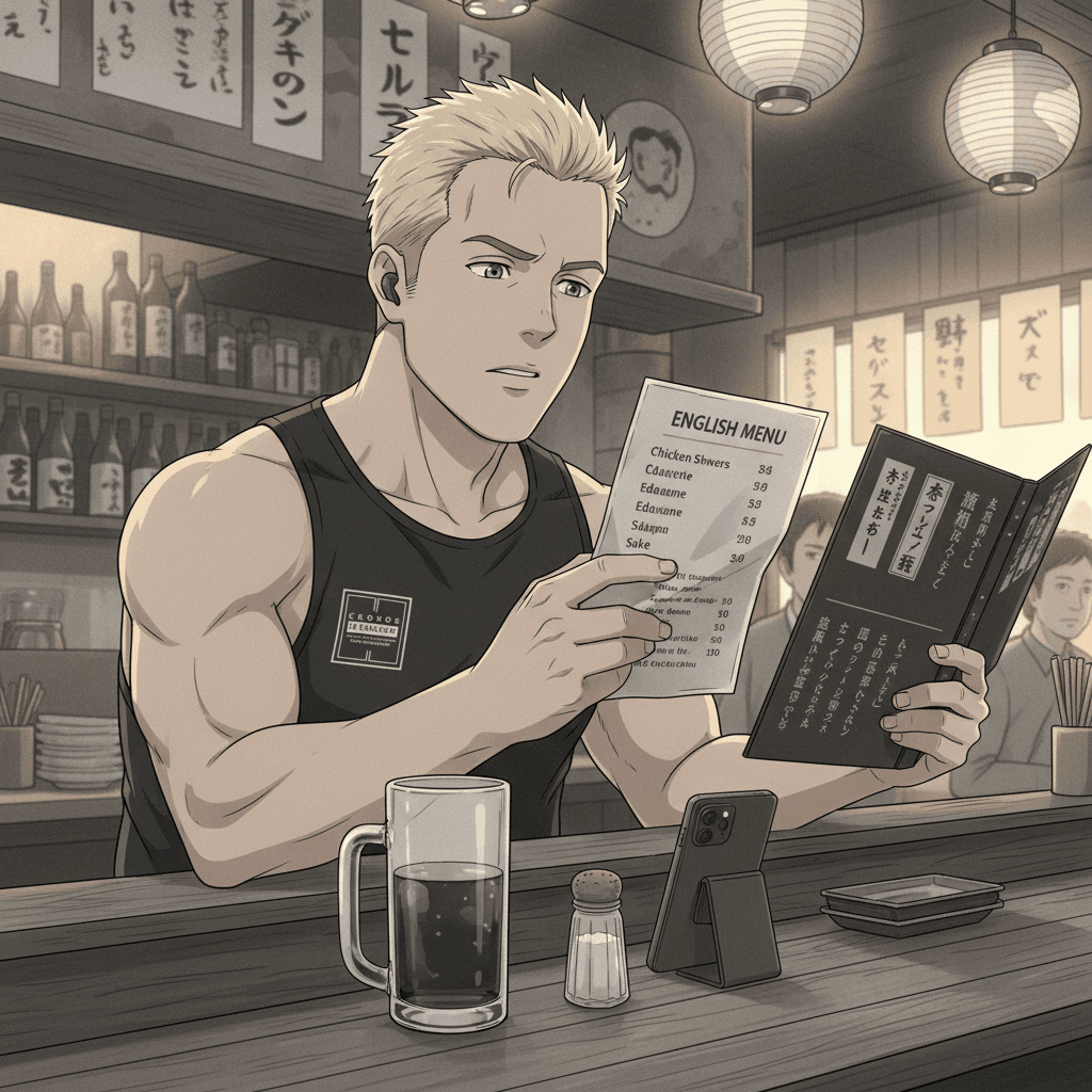
Walk into any half-decent izakaya and the Japanese menu is a glorious twelve-page document of life. Nomihoudai for two grand. Free dessert if you order the set. Toppings thrown in. Today's special chalked up with three exclamation marks. A whole secret economy of generosity. Then you, the foreigner, the absolute mug, say "English menu please" and they bring you a laminated A4 sheet with eight items on it, printed in a font designed for a toddler's reading primer, and every single deal has been quietly amputated.
Gone is the nomihoudai. Gone are the free toppings. Gone is the set that saves you nine hundred yen. What you get is the skeleton, the dishes priced at full whack, no extras, no specials, nothing, because the bloody assumption baked into the whole thing is that the foreigner won't know what he's missing and will pay more for less and say "sumimasen, arigatou" on the way out like a trained seal. It is not laziness. Laziness would be giving us the same menu. This is curation. Someone looked at the good menu, the real menu, and decided which lovely bits the gaijin doesn't get to have. That takes effort. That takes a meeting. A shower of berks in a room agreeing that the English version should contain less.
The two-tier internet nobody admits exists
Here is what genuinely makes me want to fling my phone into Tokyo Bay. This is a country that can make a vending machine apologise to you. The technical talent is not in question. The Japanese-language web can be slick, dense, generous, alive. So the bland English shadow-page isn't a skills gap, it's a decision. It is a wall, painted the colour of an old hospital, with a sign on it that says "information is for members of the in-group, and you, sunshine, are decorative."
It's tatemae rendered in HTML. The public face says "we welcome international guests, please enjoy our country." The actual structure says "we have built you a worse, dumber, more expensive parallel experience and we'd rather you didn't notice the good one exists." And the maddening part is the people who defend it. The tossers who say "well, translation is hard." Translation is hard. Copy-pasting the same coupon onto two pages is not fucking hard. A toddler with a mouse could do it. You did the difficult bit. You then chose, with full intent, to do the easy bit badly.
So I do what every long-term resident does. I keep the website in Japanese, squint at the kanji like an idiot, screenshot the menu, run it through the camera translate, and reconstruct the deal that was sitting right there the whole time. I have lived here long enough to know the rule. The English version is the decoy. The real thing is always in Japanese, it's always cheaper, and they were always, always hoping you'd be too polite to ask. Well. I'm thirty-five fucking years old and I want my free dessert.
“It is not laziness. Laziness would be giving us the same menu. This is curation. Someone decided which lovely bits the gaijin doesn't get to have.”
Nobody's raged yet. Set the tone.
You Survived This Article.
Congratulations. You are now contractually obligated to forward it to one other foreign resident who is having a worse week than you.
More Rage Where That Came From
All Rants →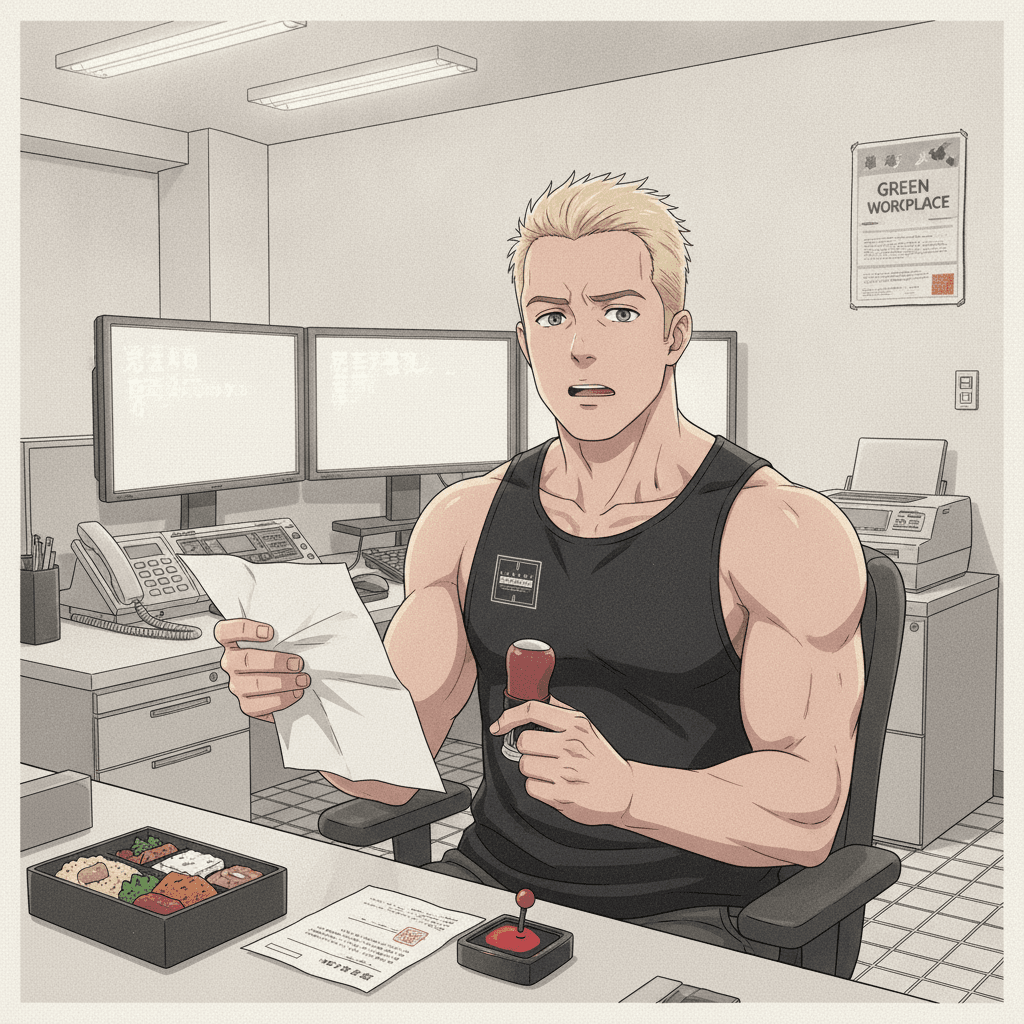
THE PAPERLESS OFFICE THAT PRINTS, STAMPS, SCANS AND EMAILS IT BACK
Inside the Japanese paperless office that prints a digital document, stamps it with a hanko, scans it back into a PDF and emails it to the person who sent it. Performed modernity wrapped around an Edo-period workflow.
WHY YOU CANNOT MAKE A JAPANESE ACCOUNT ONLINE WITHOUT CRYING
Creating an account on a Japanese website is a documented hostage situation. Why does every Japanese sign-up form reject you, demand your name four times, and forbid a strong password? Sit down.
JAPAN JUST DECIDED YOUR MEDICAL HISTORY BELONGS TO A CHATBOT
Japan's AI data privacy law revisions quietly scrapped consent for sharing your sensitive personal data, as long as it feeds the great national AI machine. The country that needs a fax to confirm your address now wants your medical records, no permission required.
Comments
…